HANDMAID’S TALE SEQUENCE DESIGN
HANDMAID’S TALE SEQUENCE DESIGN
10 .
02.
04.
TYPOGRAPHY
01.
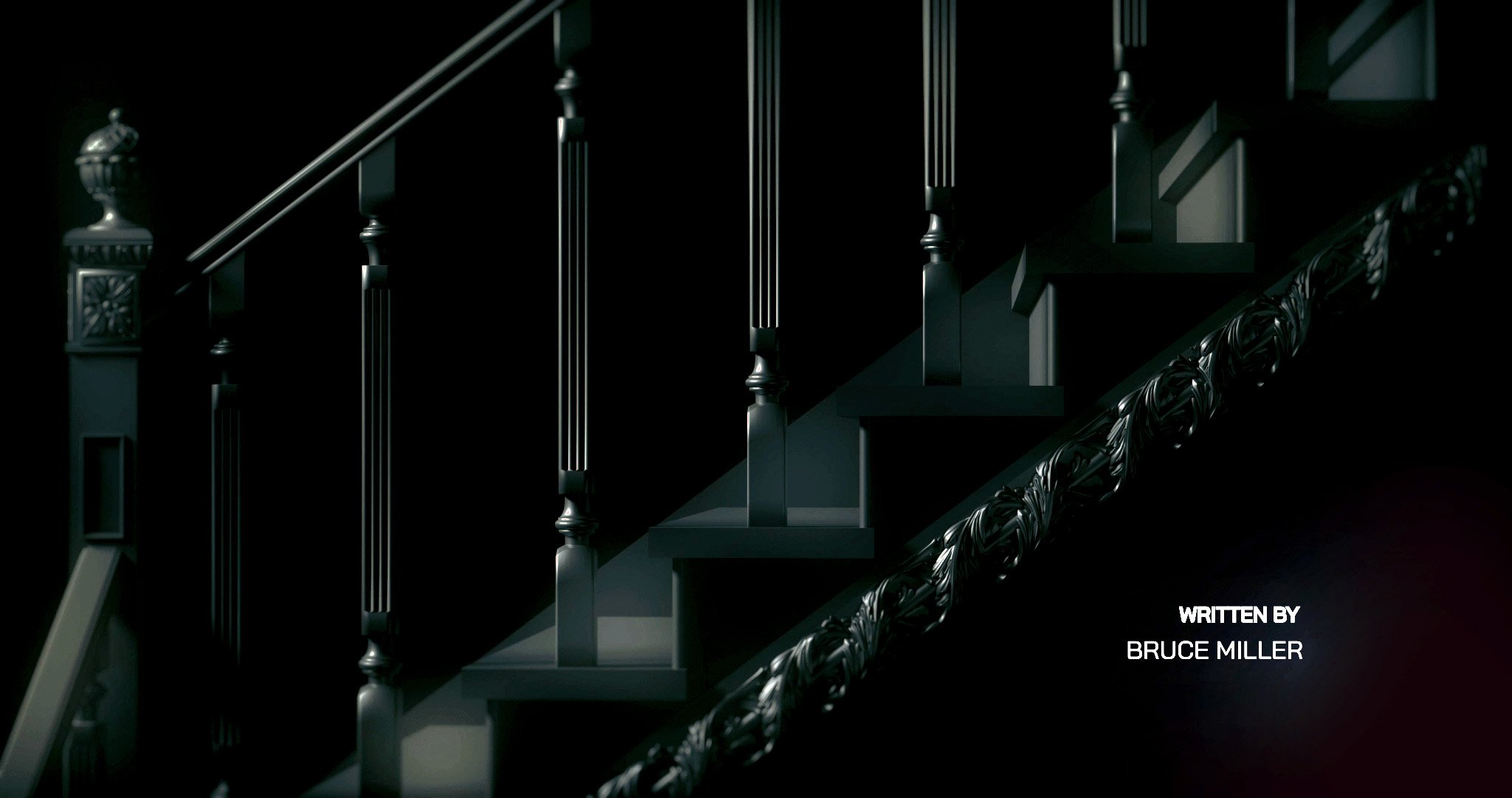
For this project, I decided to try to visualize what the Handmaid’s Tale Title Sequence would look like if it was entirely CG, as the original is live action.
STYLEFRAMES
Each frame represents motifs and themes found in the series. The first frame of a close up of the electrical batons used by the Aunts represent rebellion, rage, and control. The second frame, a shot of the staircase represents order amongst chaos with the repetitive lines and bold contrasting colors of green and red. The third frame, a closeup of a glowing red Gilead flag represents societal expectations representing the new way of life forced upon society due to the pandemic. The last scene, of the bonnet represents feminism, with a sharp and powerful red tone.
03.
The typography for these frames was based on the cinematic, strategically filmed series. I decided to go with BAI JAMJUREE due to it’s orderly, square structure thats easily read and powerful feeling coupled with CHAMPION FEATHERWEIGHT’s bold and contrast feel further adding to this look.


